
August 2022
I was recently asked by a grad student for pointers on giving a presentation, so here we are. Feedback is welcome.
THE PROBLEMS WITH POWERPOINT
Edward Tufte, the world’s foremost expert on the graphical presentation of data, has written a compelling broadside against PowerPoint (Tufte 2006). He offers a much more eloquent critique than I’m capable of. It’s well worth the $5 Ed charges for it.
In the old days, if you wanted an overhead you had to print or photocopy your slide onto a transparency. This took time, effort, and expense—among other things, transparencies tend to jam copiers—so it served to minimize the number of slides you prepared. PowerPoint removed these barriers, so the number of slides the average presenter used mushroomed. In practice, this means that a slide accompanies every uttered word.
This raises an obvious question: why talk at all if your audience can just read the PowerPoints? Also, you want your audience to look at you, not the screen.
Putting every uttered word on a slide also has a deleterious feedback effect. If every word to be spoken appears on a slide, the slides will become the basis for the talk. Many presenters won’t rely on notes for their presentations anymore, because the maximal version of the presentation appears in the slides. So they’ll just present off their PowerPoint.
This is a serious liability for various reasons. It becomes harder to emphasize individual points, because they appear on just one of 30-odd slides. It’s harder to insert a hard delineation into a talk (e.g., a shift in direction, focus, or emphasis), because it’s just one slide in a sequence. It becomes awkward to insert rhetorical questions, metaphors, puns, and other rhetorical gambits that both hold the audience’s attention and insure they understand the presentation. Finally, the odds are high that at least once you’ll move on to the next slide before your audience is still thinking about the current slide. If this happens repeatedly the audience will get frustrated. You don’t want that when your presentation determines whether you’ll get a tenure-track job.
HOW TO PRESENT QUANTITATIVE RESULTS
Here’s one thing that should never be in a PowerPoint: a full-size regression table, like this:

Source: Wolfinger, Mason, and Goulden 2008.
The font in a normal regression table will be too small to read on a projection screen. Full stop. Yet I can’t say how many times I’ve seen this abomination. The solution is to make a graphic of the key effect sizes. Here’s what I’ve used for the above table:
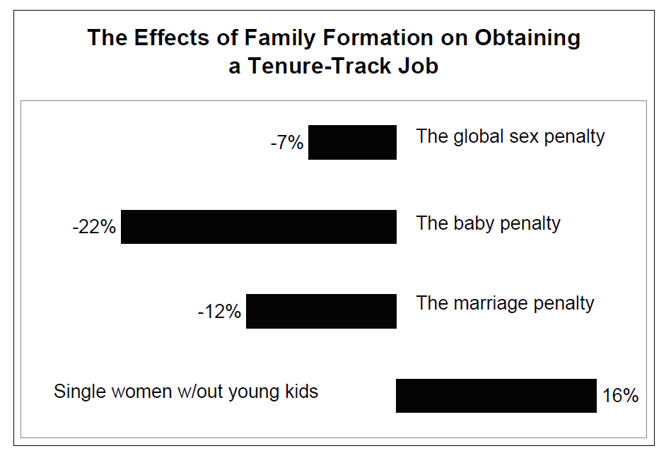
This tells you everything you want to know about the regression table: single women without young kids get tenure-track jobs at a higher rate than wives, mothers, and men. If you’re presenting to an academic audience, go ahead and distribute a paper handout with all the regression tables on it. Academics like looking at regression tables, and they’ll want to see if your model has obvious problems. Non-academic audiences do not like looking at regression tables.
Suppose your data are qualitative? Just read them, slowly and clearly. Do you want your audience to be looking at you or the screen?
Duke sociologist Kieran Healy has a spiffy presentation about making slides. I don’t agree with him 100% on everything, but he definitely makes some good points.
HOW I PRESENT
I don’t use PowerPoint. Instead, I put my slides in a .pdf document. At a bare minimum, my slides contain my results. I’ll also usually add a slide for my data sources, because that contains a lot of details that are tedious to read out loud. If I have hypotheses or a conceptual model or something, I’ll add a slide. Sometimes I’ll add one with my conclusions on it, as that’s what I’ll leave up at the end of the talk (so people remember the findings). And that’s it.
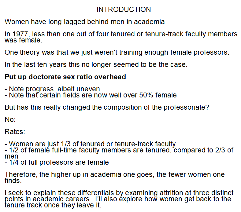
Then I’ll prepare notes. The notes contain the language I’d like to use in my talk. I’ll use a lot of hard returns, boldface, and bullet points. The latter don’t necessarily indicate subsidiary thoughts or concepts, but make my notes easier to absorb at an intermittent glance. Here’s an example of my notes:
Here’s me giving a talk based on these notes and results.
As you’ll see, I refer to my notes only when I have to. My goal is to tell an engaging story based on my data, with the minimum amount of methodological detail needed to convince my audience that my story is true. As my thesis advisor once told me, people want to see a completed house, not the 2 by 4s.
One way you can avoid looking at your notes is to practice your talk. Obviously this is important if it’s a high stakes engagement, like a job talk. Otherwise you won’t know if you have too many slides, and consequently will be running through them too quickly. Based on my experience, you probably will be.
Obviously you’ll include a lot more methodological details if you’re talking to an academic audience, but still fewer than you pondered in doing your research. Most of your audience won’t be specialists on your precise subject or model, or just won’t care That having been said, be prepared to answer arcane methodological questions (I’m still proud of the fact that in 2002 I was able to tell the late Leo Goodman why I estimated a complementary log-log regression rather than a logit).
GIVING A ROUNDTABLE PRESENTATION
Unfortunately the PowerPoint diarrhea style seems to have bled over to roundtables, with people distributing paper copies of enormous PowerPoint decks. To make matters worse, sometimes multiple slides are crammed onto a single page. At the recent annual meeting of the American Sociological Association, I was handed this page. I put on two pairs of reading glasses, but the contents of the literally microscopic print will forever remain a mystery to me:
Don’t do this. Instead, print legible copies of the slides you’d use for a regular talk—if you’ve read this far, that won’t be a lot of slides—along with regression tables. If it’s a roundtable, it’s probably an academic conference, so tables will be appropriate to the occasion.
POSTERS
In my experience posters tend to far and away constitute the best presentations of research. If nothing else, they don’t entail the redundancy of the presenter intoning every word on the screen. They let the reader consume the research at his or her own pace, asking questions of the researcher as needed.
I bring up posters primarily as an object lesson: consider why they’re more effective than papers delivered at sessions.
Here’s the most useful advice I have on posters: get them printed on cloth. Then you don’t have to be one of those dweebs wandering through airports carrying big tubes. You just stuff them into your suitcase, and you’re good to go. After your session you get a bespoke tablecloth that’s sure to be a conversation-starter.
REFERENCES
Tufte, Edward R,. 2006. “The Cognitive Style of PowerPoint.” Available here for $5.
Wolfinger, Nicholas H., Mary Ann Mason, and Marc Goulden. 2008. “Problems in the Pipeline: Gender, Marriage, and Fertility in the Ivory Tower.” The Journal of Higher Education 79:388-405, available here.